- Workforcemanagement
- b2b
- Digitalcertification
- Basic Identity
- Website Design
- 3d Modeling
- Website Development
2022
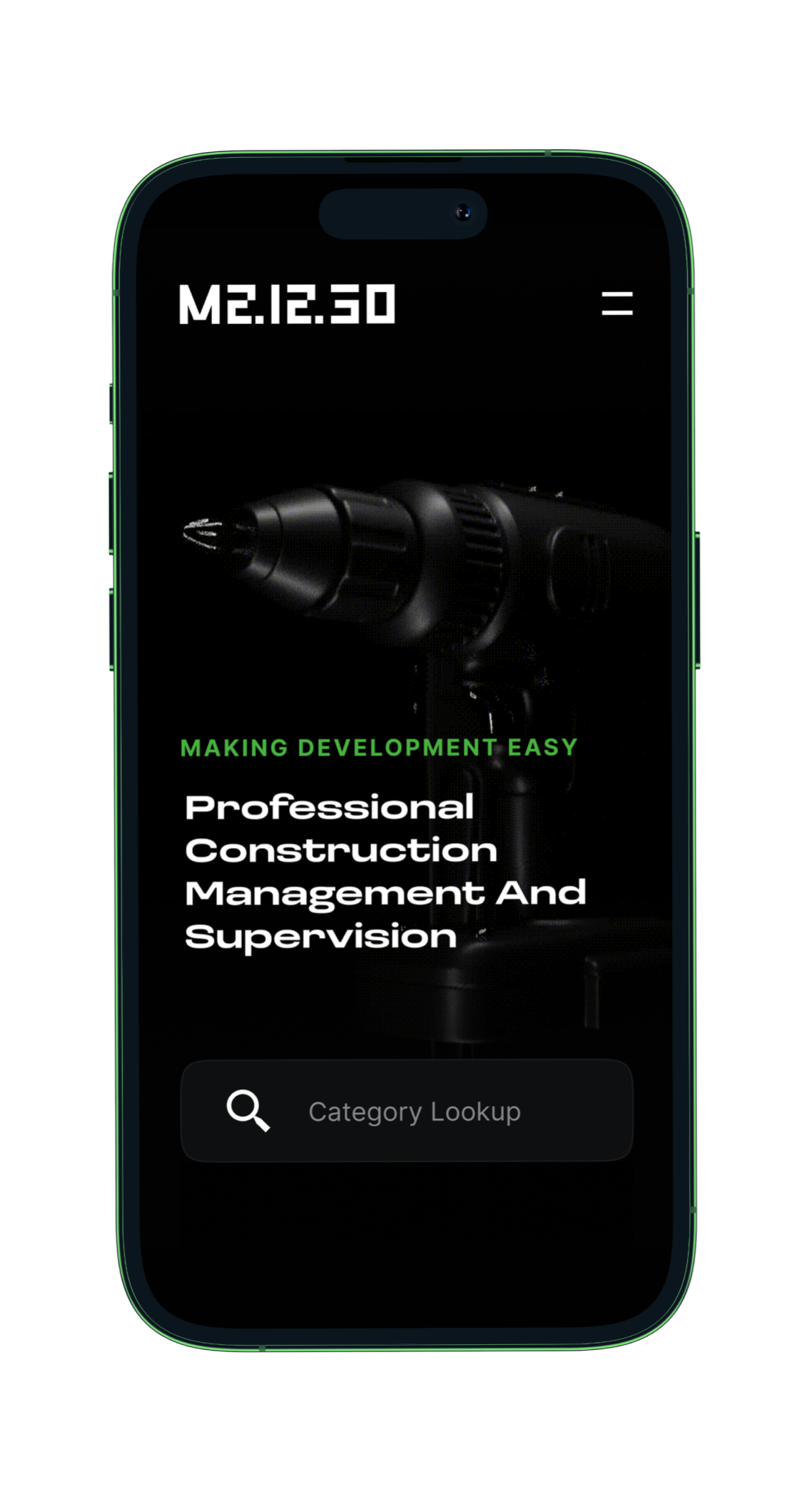
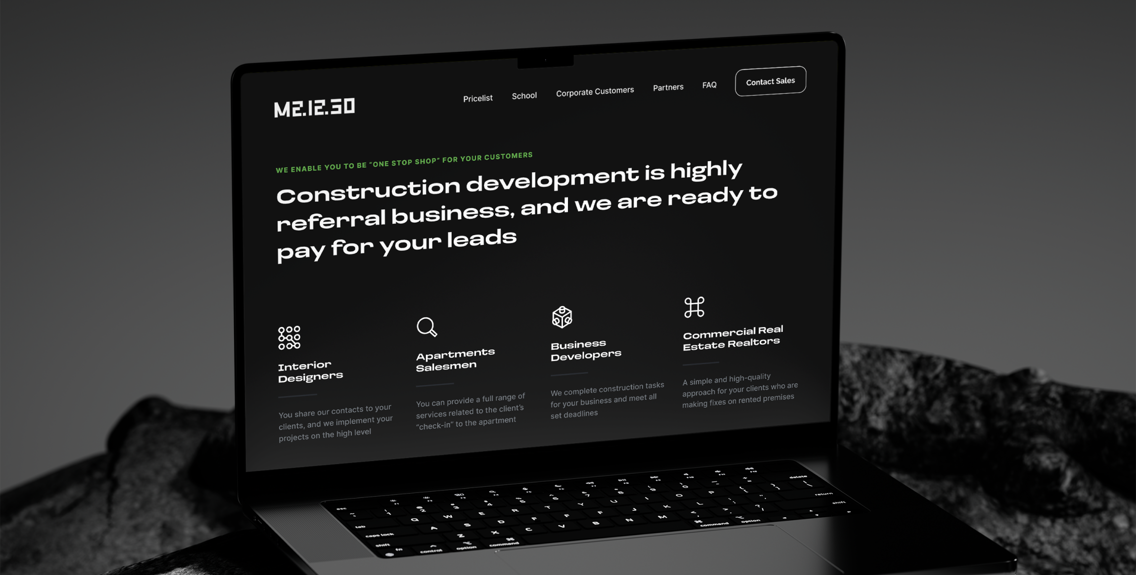
M2.12.30 connects certified construction professionals with businesses across Europe. Platform simplifies workforce sourcing, project management, and pricing automation, acting as a utility layer between tradespeople and the B2B clients who rely on them.
WorkersSearchable at launch
IncreaseQualified Inquiries
ImprovementConversion with chat bot launch
SecondsAverage Page Load
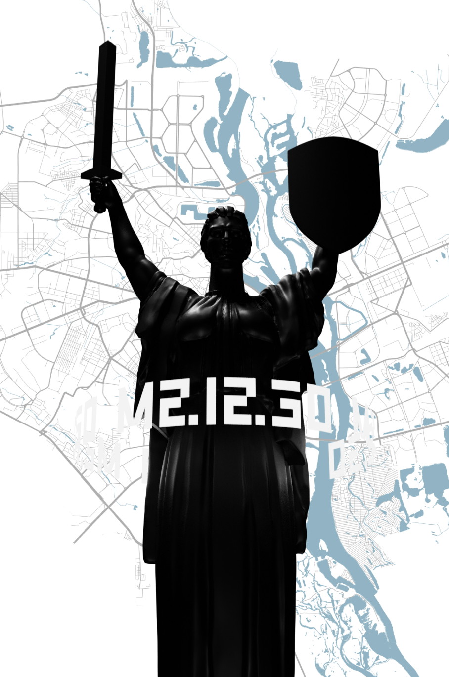
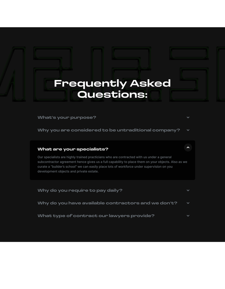
The construction and real estate ecosystem is notoriously fragmented. M21230’s ambition was to build a trusted digital layer that could unite workforce certification, project staffing, and lead qualification — all under one bold and memorable brand.
The challenge was to simplify the experience for B2B clients while empowering certified workers with better visibility and modern tools.
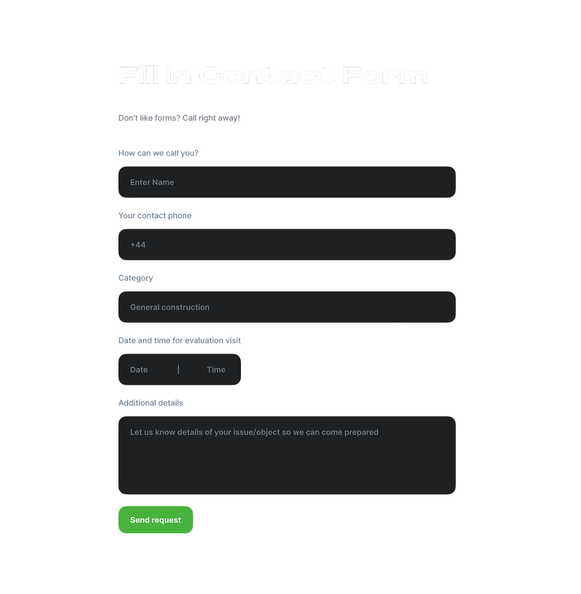
We designed intelligent contact flows including a streamlined form system to align with real B2B decision-making behaviors.
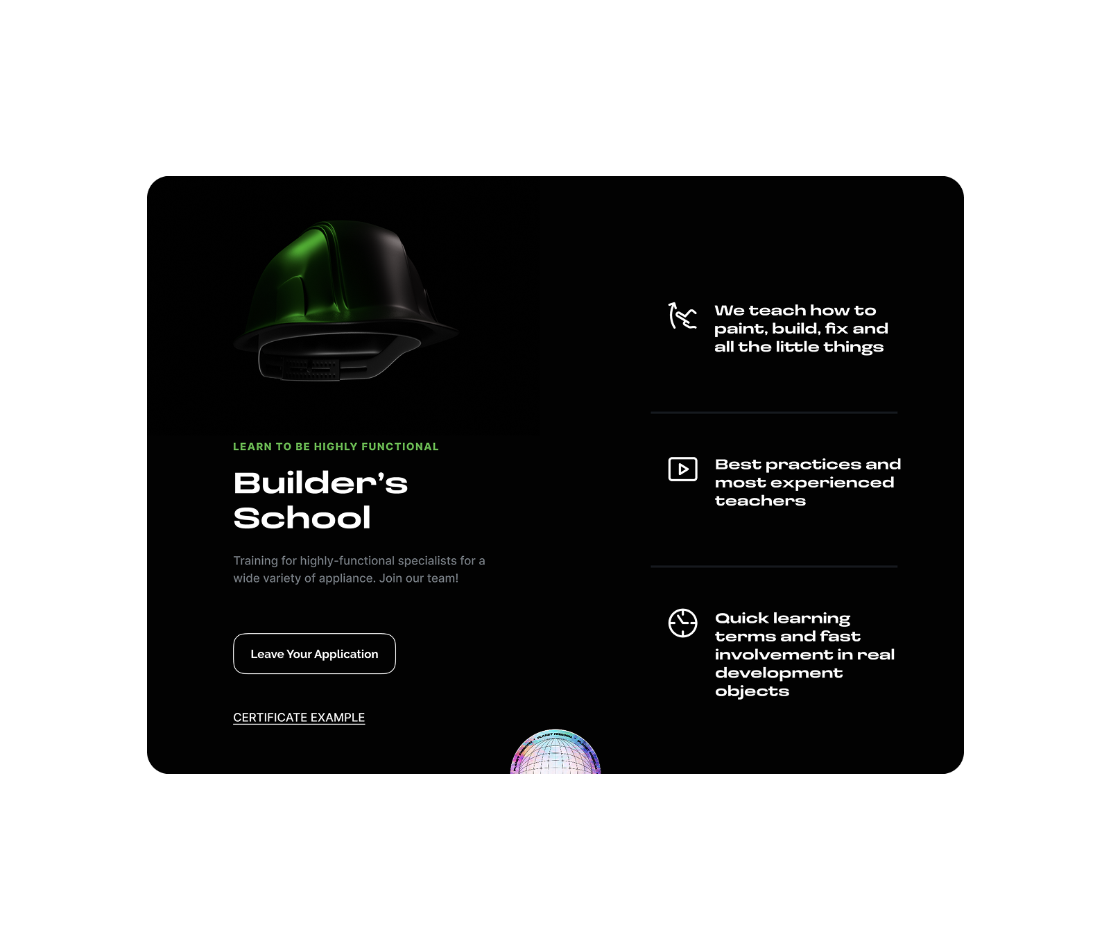
Experience was tailored for fast-moving professionals like interior designers and real estate brokers, offering instant access to verified labor and project estimates within seconds.
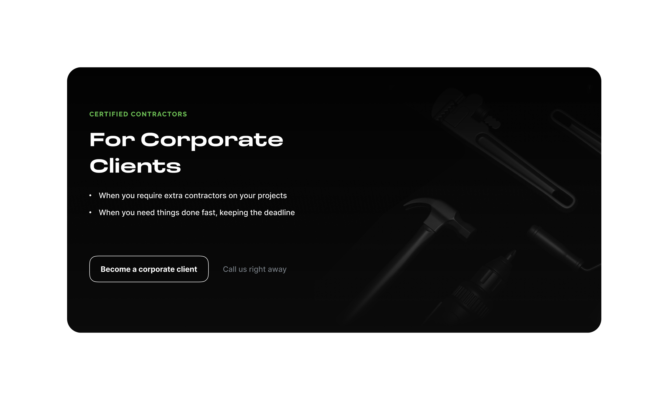
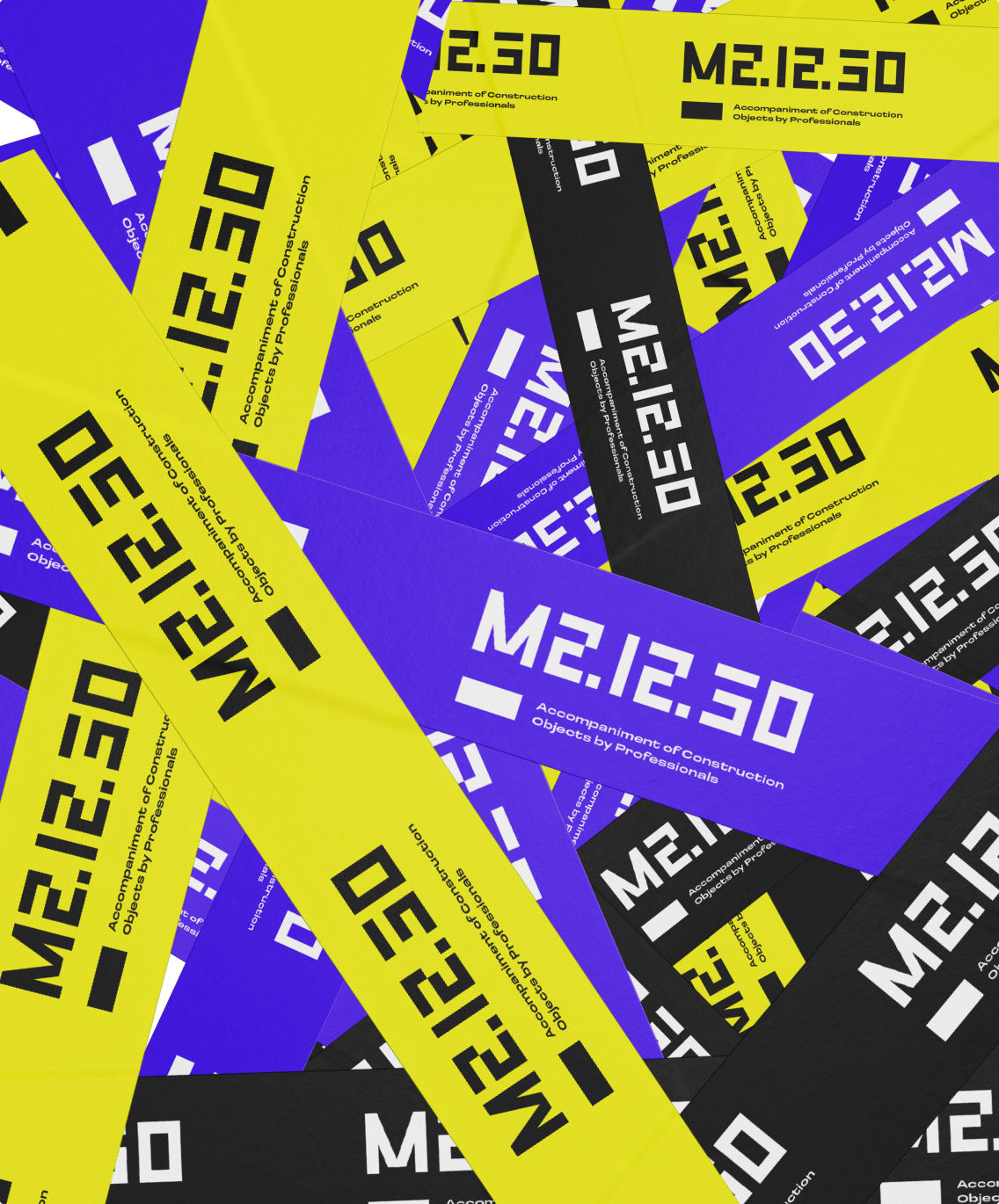
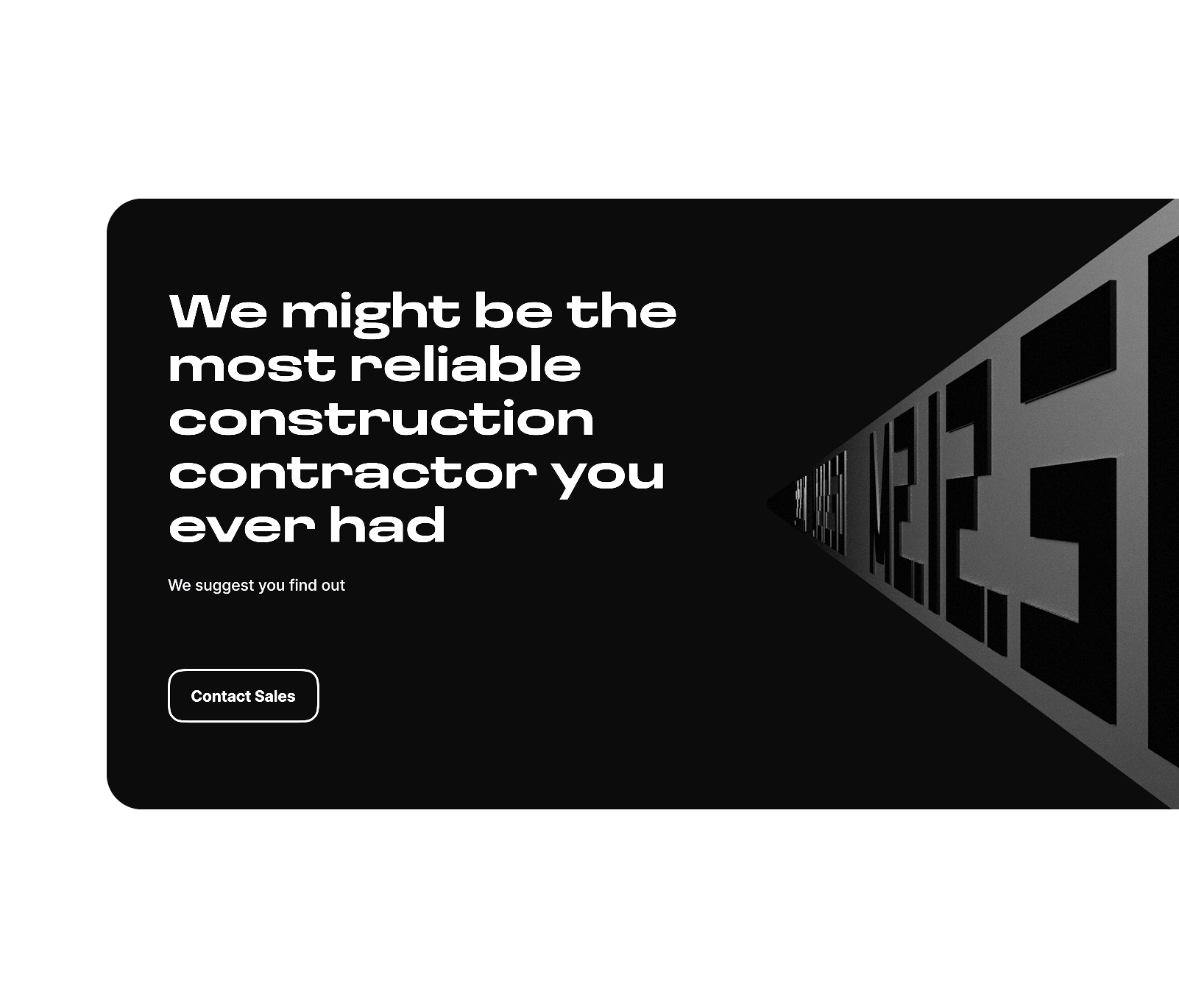
Industrial Intelligence in Black & Electric Green
M21230’s identity system is built for high-contrast clarity and visual precision. The all-black interface is punctuated with electric yellow/green highlights, signaling urgency, confidence, and control.
We developed a custom logo, bold typographic scale, and 3D visual system that ties together both functional and brand layers. The design is both utilitarian and striking — built to resonate with B2B clients who expect efficiency and visual authority.
Used for headlines works best with big titles

Used for Web app works best with regular text buttons

Scalable Search and Automated Sales Funnel
At its core, M21230 is powered by a searchable workforce database, supported by digital certificates issued through its in-house certification school. Every professional in the system is tagged, verified, and accessible via a powerful frontend search experience.
We integrated a Telegram-based assistant bot that provides instant project estimates, and synced all contact points to a backend CRM. Dynamic forms adapt to job type, location, and timing — reducing friction while improving lead quality.
next js
typescript
aws
node js
postgresql
elasticsearch
telegram
- FINTECH
- Blockchain
- Decentralisedfinance
- Digitalcurrency
- Graphic Design
- Website UI
2022

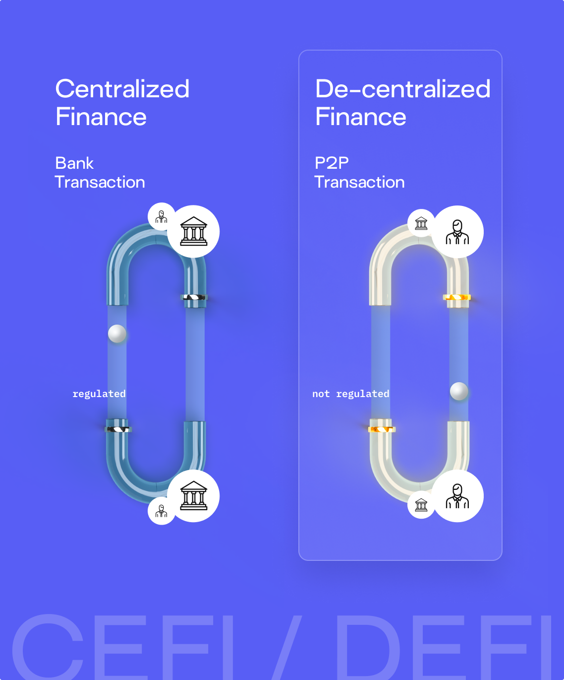
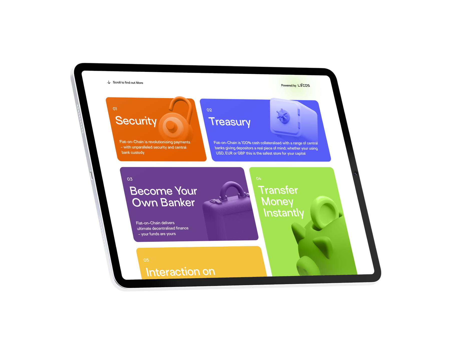
Fiat-on-Chain introduces a new form of programmable money - combining central bank custody, instant settlement, and quantum-grade security in one globally accessible blockchain-based currency.
The design goal was to translate this revolutionary model into a bold, graphic-first web experience that communicates both technical depth and systemic clarity.
The brand needed to feel like a finance protocol, not a fintech startup — but with enough visual drama to assert itself on a global stage.
We created a layered design system built on contrast, dimensionality, and motion.
The brand uses a rich multi-color palette - bright gradients, coded hues, and neon accents - layered against deep blacks and atmospheric backdrops to evoke speed, encryption, and signal intelligence.

Dimensional. Coded. High-speed
Fiat-on-Chain’s visual identity is dynamic and system-based, built for a protocol-level product operating in real time. The brand’s color logic maps to different system states and user actions, creating a visually legible structure across all screens.
3D visualizations add weight and presence, helping to communicate concepts like liquidity movement and custody handoff with visceral clarity. Diagrams are everywhere — not decorative, but functional — forming the backbone of product explanation and visual navigation.
Used for headlines works best with big titles