- FINTECH
- Blockchain
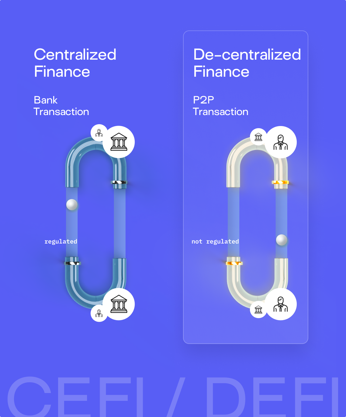
- Decentralisedfinance
- Digitalcurrency
- Graphic Design
- Website UI
2022
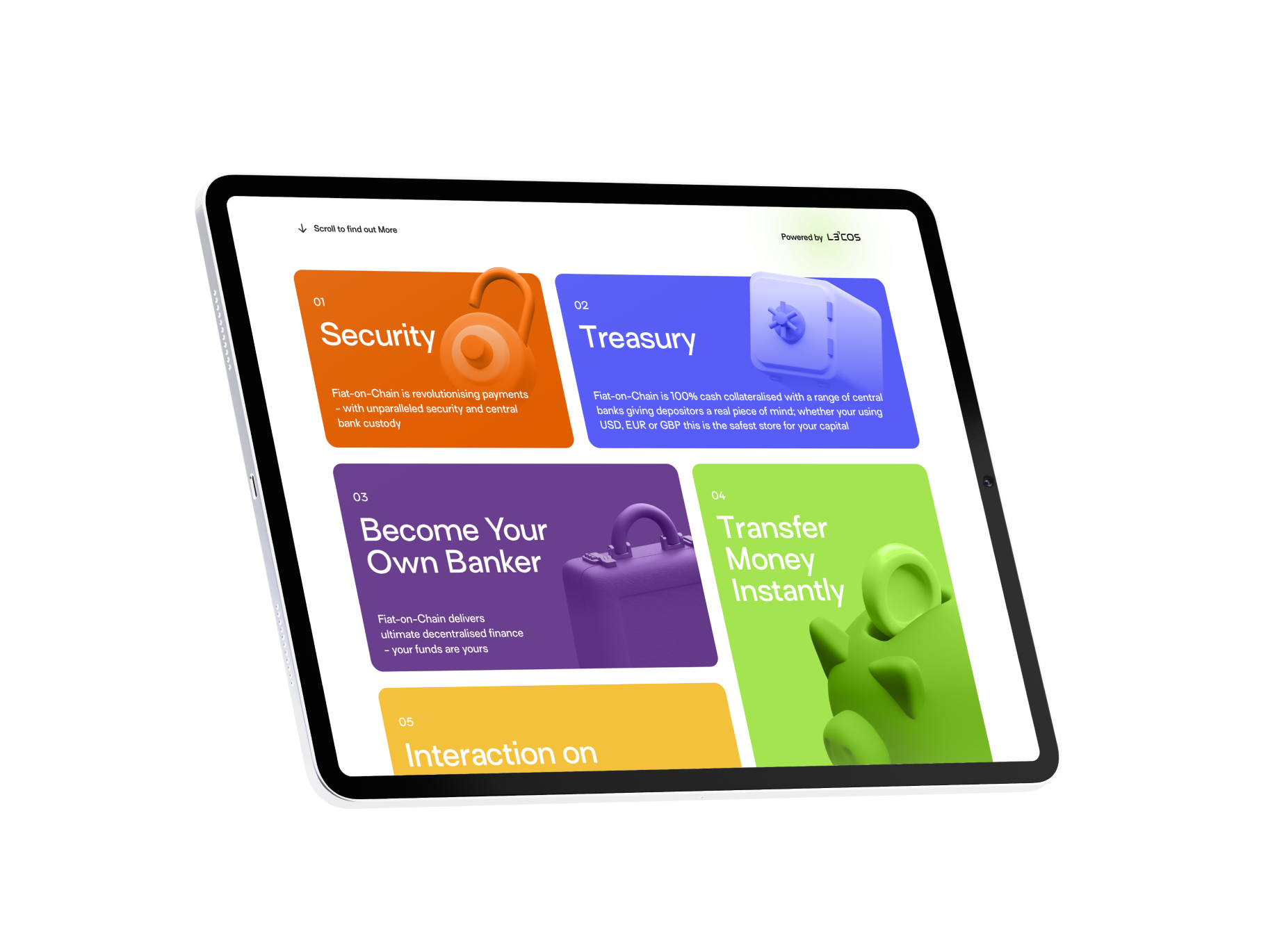
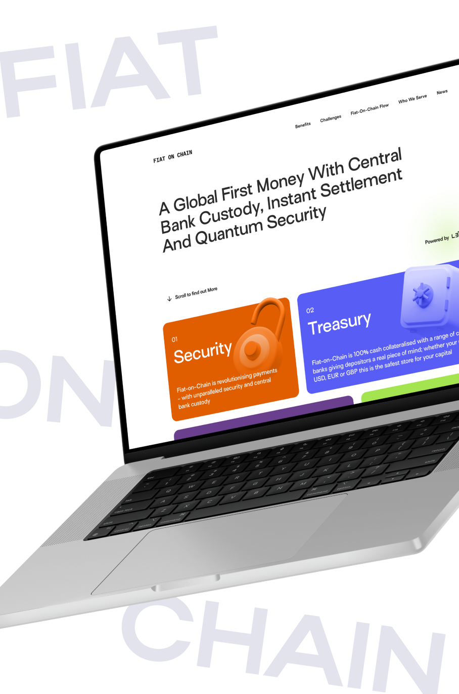
Fiat-on-Chain introduces a new form of programmable money - combining central bank custody, instant settlement, and quantum-grade security in one globally accessible blockchain-based currency.
The design goal was to translate this revolutionary model into a bold, graphic-first web experience that communicates both technical depth and systemic clarity.
The brand needed to feel like a finance protocol, not a fintech startup — but with enough visual drama to assert itself on a global stage.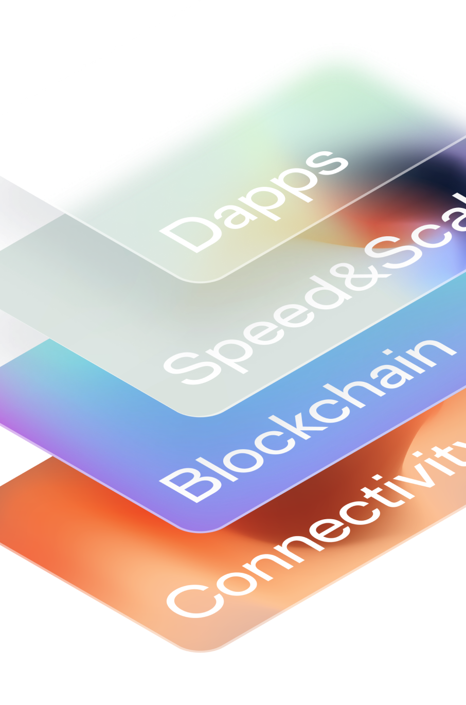
We created a layered design system built on contrast, dimensionality, and motion.
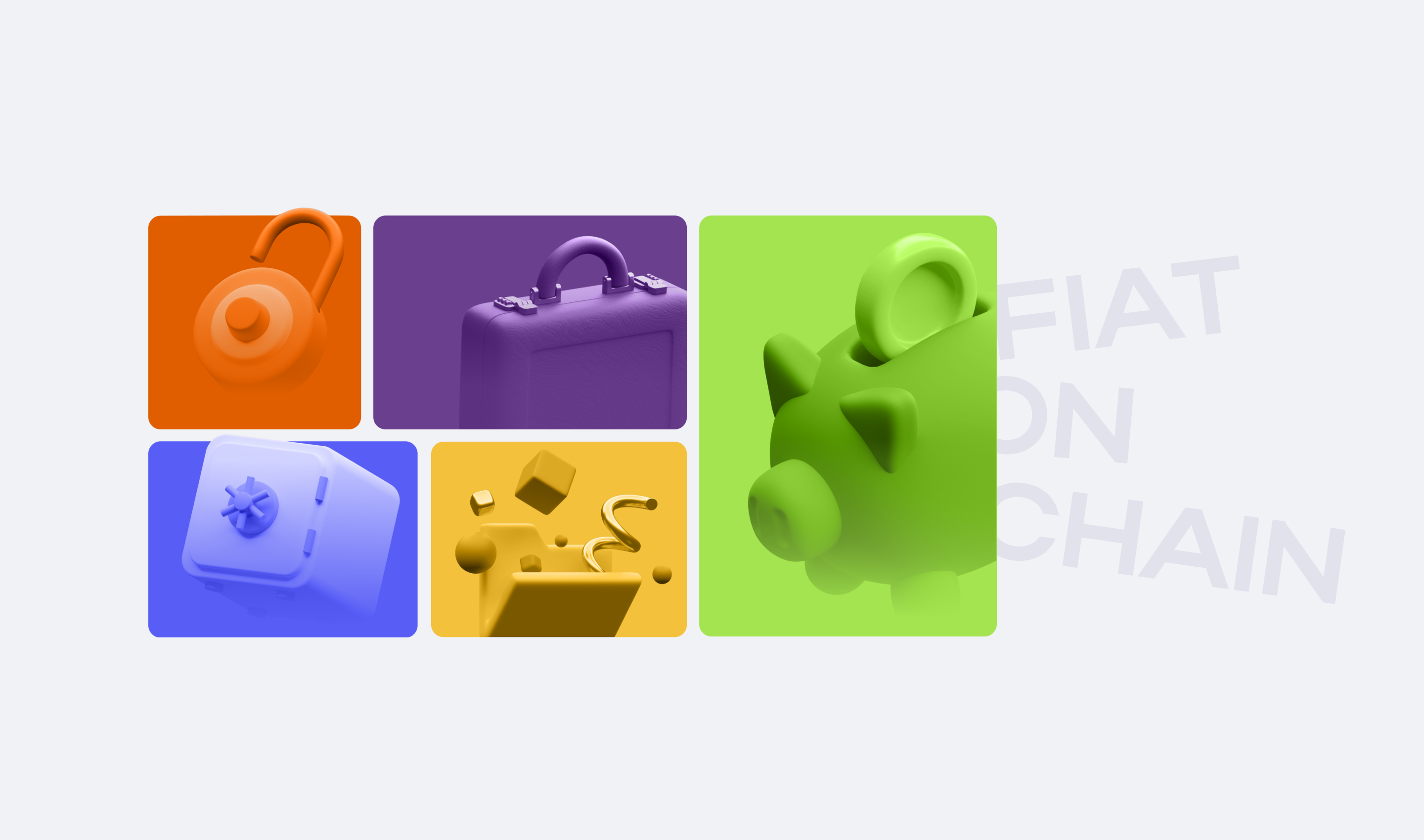
The brand uses a rich multi-color palette - bright gradients, coded hues, and neon accents - layered against deep blacks and atmospheric backdrops to evoke speed, encryption, and signal intelligence.
Dimensional. Coded. High-speed
Fiat-on-Chain’s visual identity is dynamic and system-based, built for a protocol-level product operating in real time. The brand’s color logic maps to different system states and user actions, creating a visually legible structure across all screens.
3D visualizations add weight and presence, helping to communicate concepts like liquidity movement and custody handoff with visceral clarity. Diagrams are everywhere — not decorative, but functional — forming the backbone of product explanation and visual navigation.
Used for headlines works best with big titles

- RealEstate/architecture
- EnterpriseWebsite
- BrandExperience
- Web Design System
- Website Development
- Custom CMS Development
2021
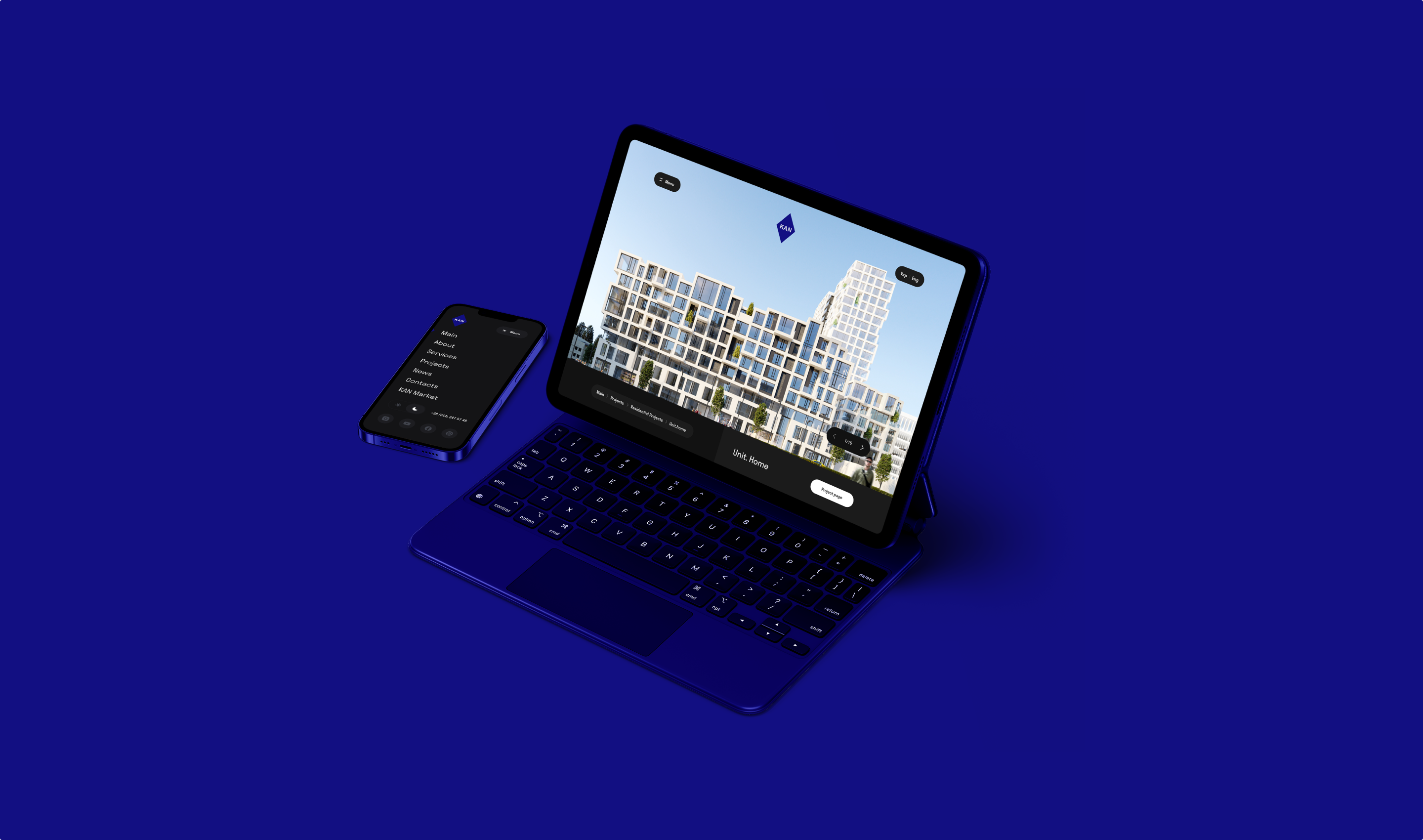
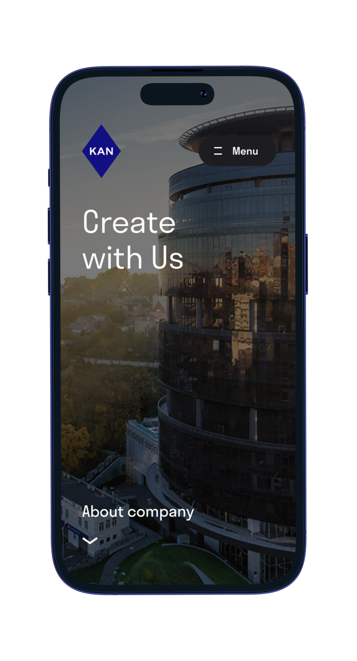
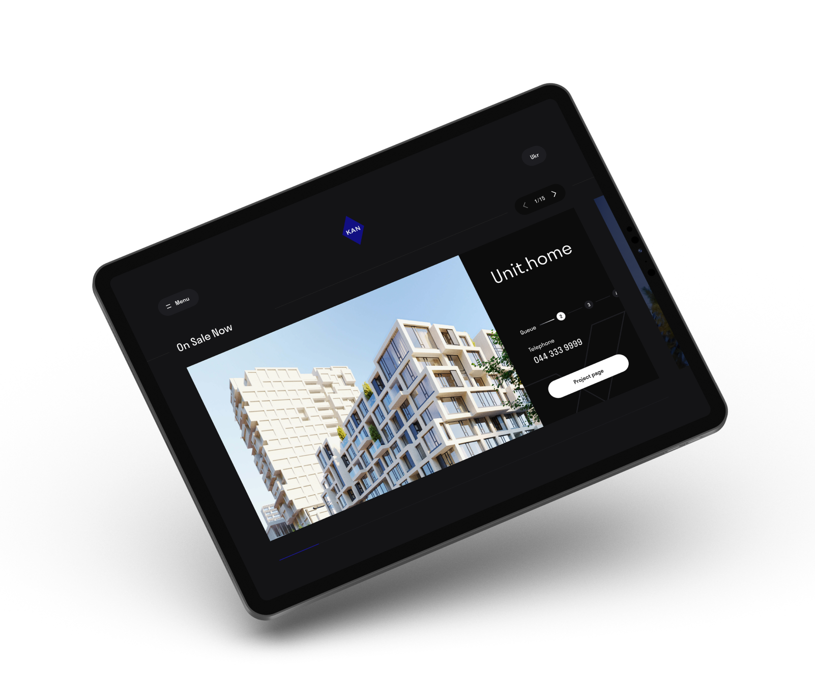
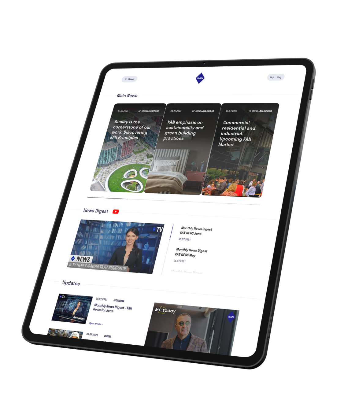
KAN is one of the largest and most respected building development companies across Europe - known for its architectural innovation, large-scale mixed-use projects, and a legacy of excellence spanning decades.
Developmentsunified under one content system
Assetsmigrated and restructured
Faster Loads2.1s average page load, down from 6.4s
Faster Publishingfor internal content teams
KAN’s existing digital presence didn’t reflect its scale or legacy. With dozens of real estate developments, awards, and decades of architectural leadership, the brand needed a website that could act as both a comprehensive platform and a digital brand ambassador.
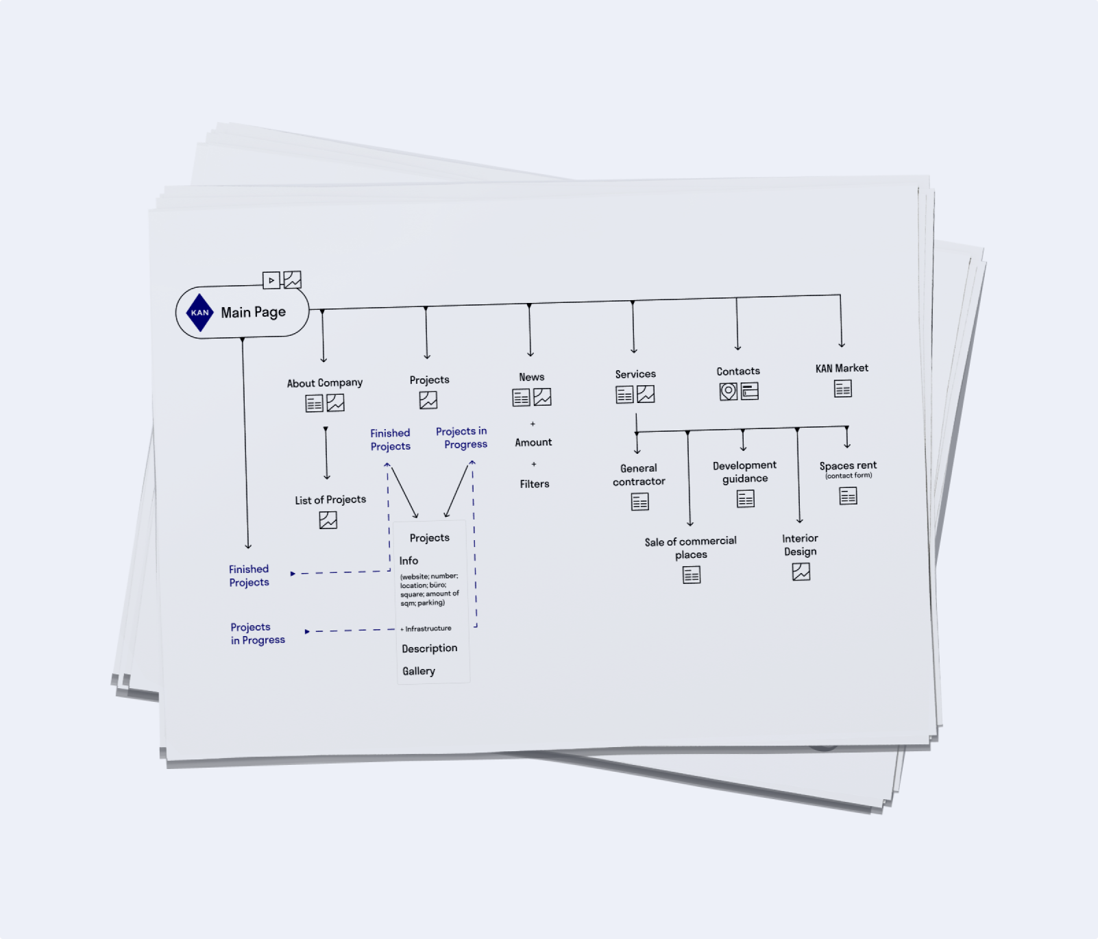
The goal was to create a multi-page experience that captured KAN’s identity, displayed real estate content in flexible ways, and could evolve with the company’s future growth.
The design process began with a full brand immersion, extracting KAN’s visual language and turning it into a digital system.
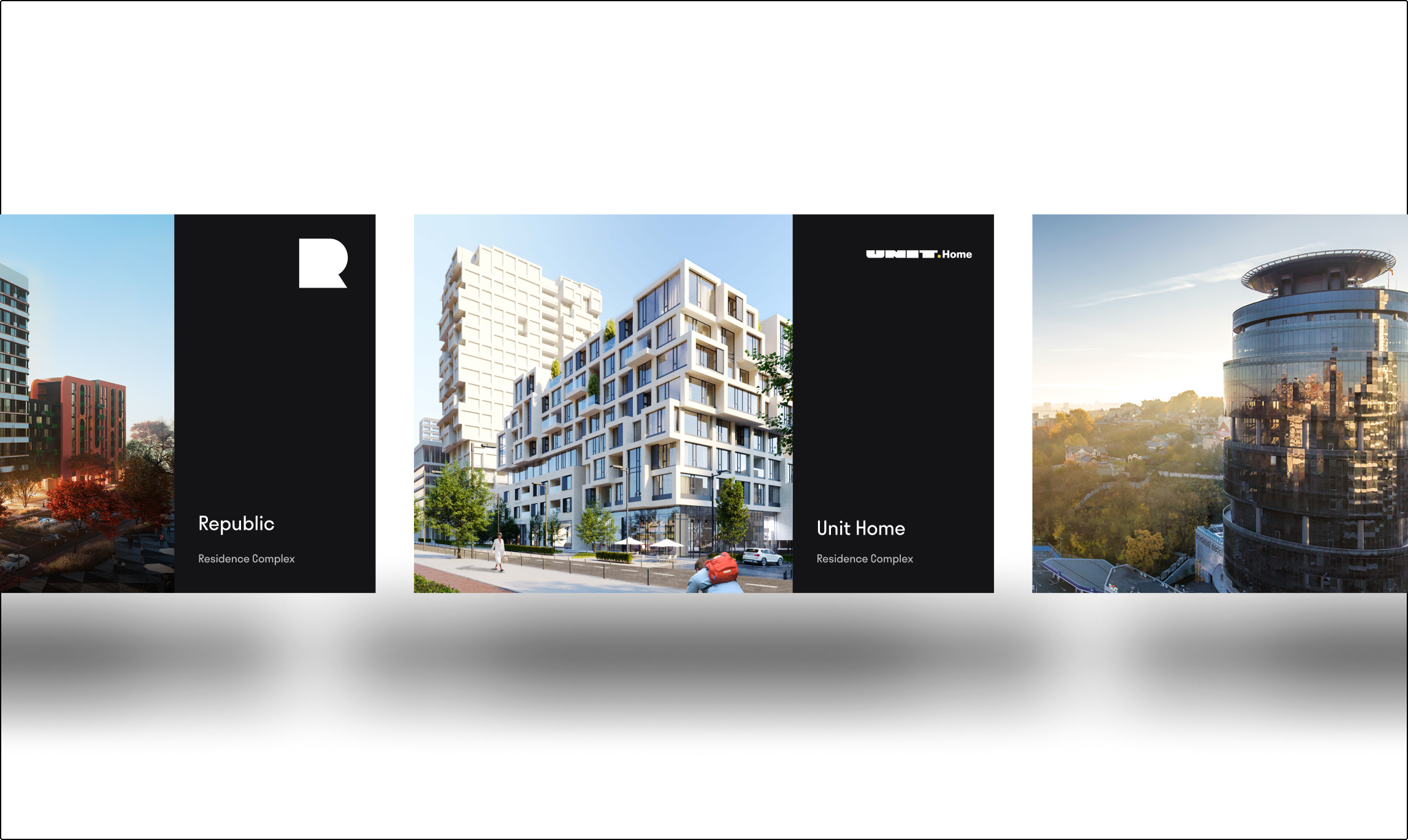
We developed a modular UI framework that included custom icons, consistent sizing systems, and adaptive layout logic for displaying content across a wide range of building types and project categories.
Precision, Structure, and Brand Legacy
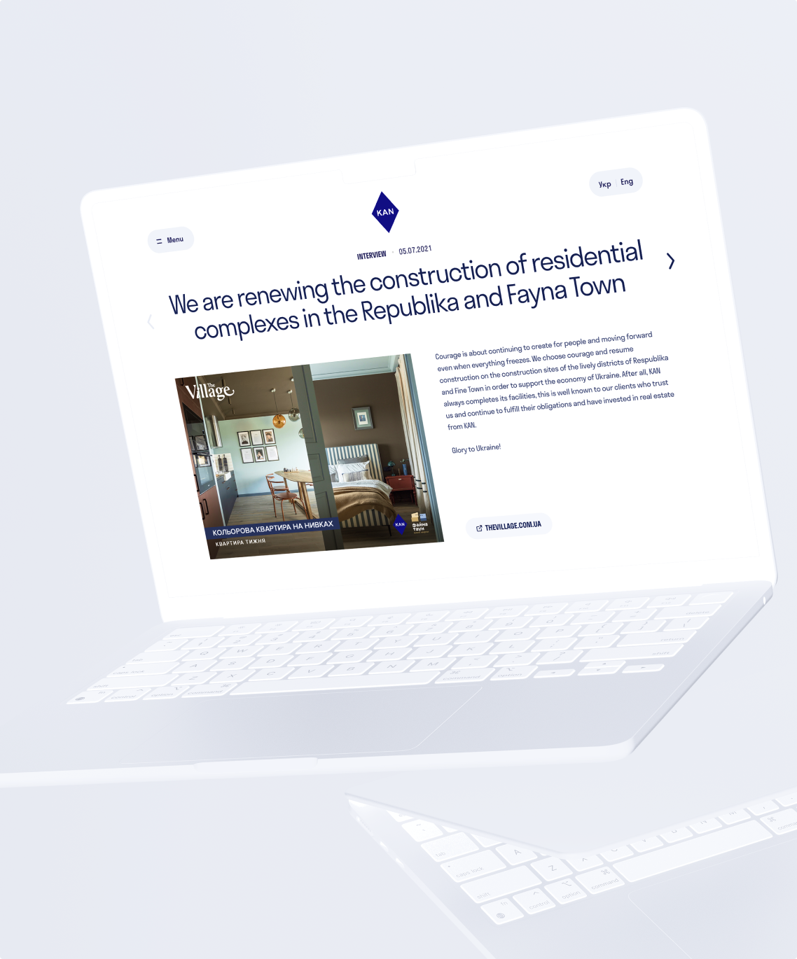
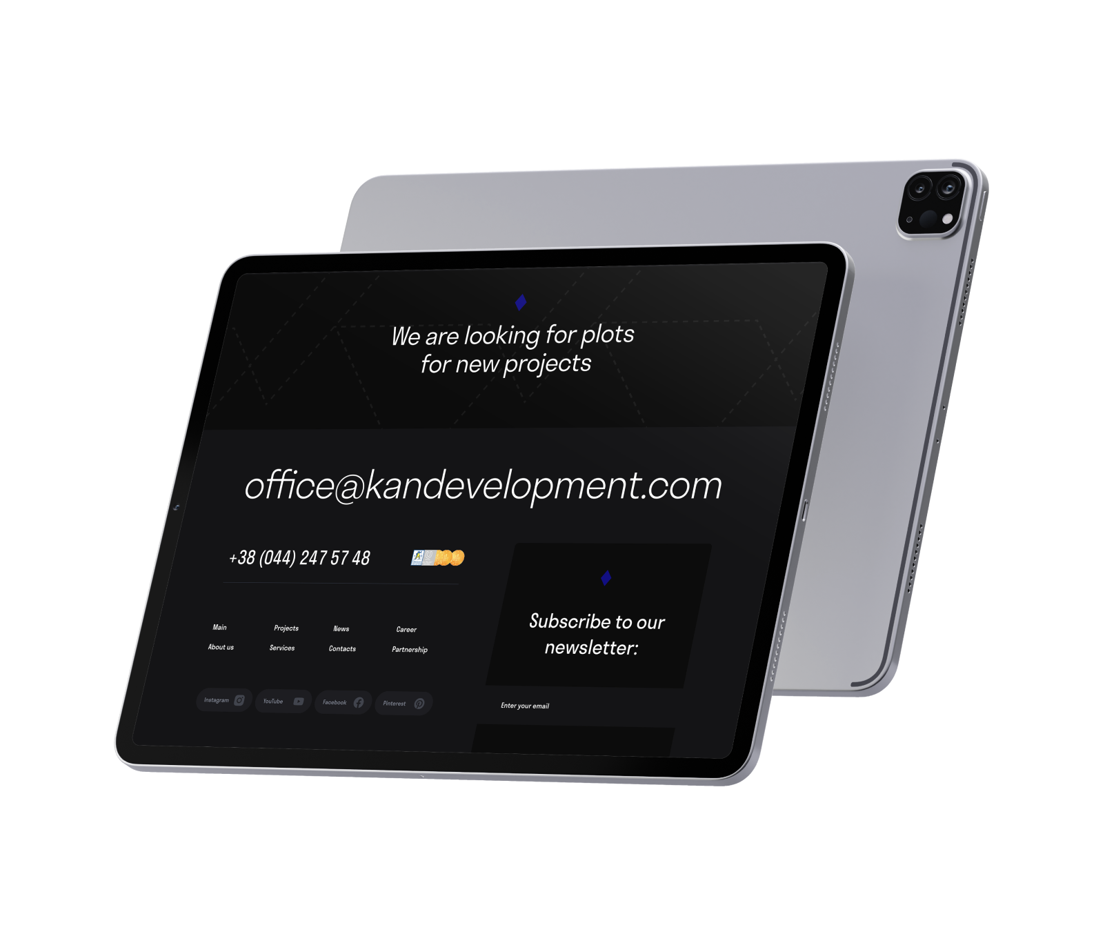
KAN’s website reflects its identity: structured, modern, and trustworthy. The interface embraces clarity and space, using neutral tones, measured typography, and subtle animations to give content room to breathe. The design system is tightly defined, with custom iconography, scalable UI elements, and refined layouts that support everything from residential listings to press releases.
Every page reinforces KAN’s reputation for quality, while highlighting its experience and legacy in building Ukraine’s most recognizable developments.
Used for headlines works best with big titles

Used for Web app works best with regular text buttons

Built for Scale and Longevity
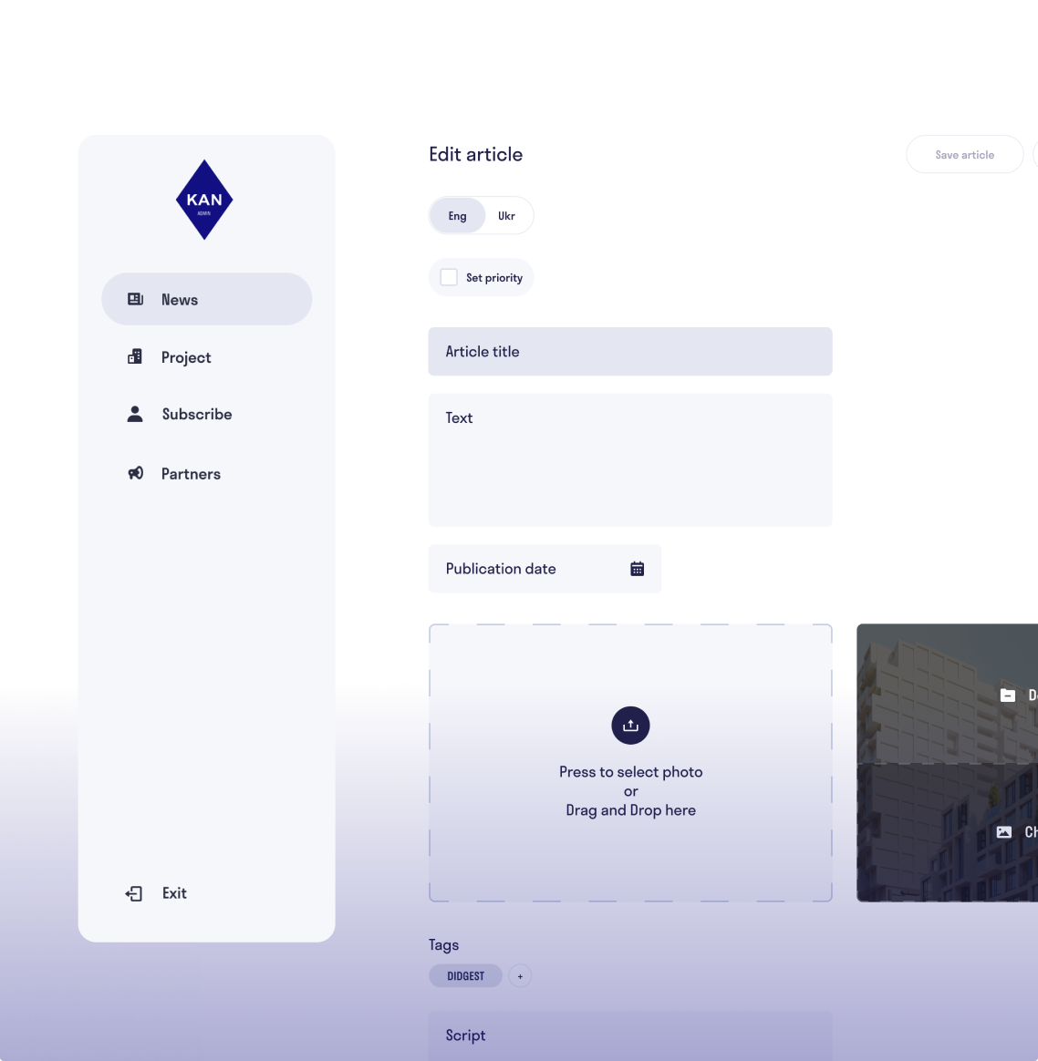
The site was developed as a multi-page platform with a custom CMS, giving KAN’s internal teams full control over content without sacrificing structure. The CMS supports modular layouts, enabling flexible page creation while maintaining consistency across the site.
A focus on performance, SEO, and enterprise reliability ensures the site remains fast and accessible to a wide range of audiences — from prospective buyers and media to investors and partners.
next js
typescript
aws
docker
csharp
mongo db
terraform