- Corporatesoftware
- Governmenttech
- B2BSAAS
- Basic Identity
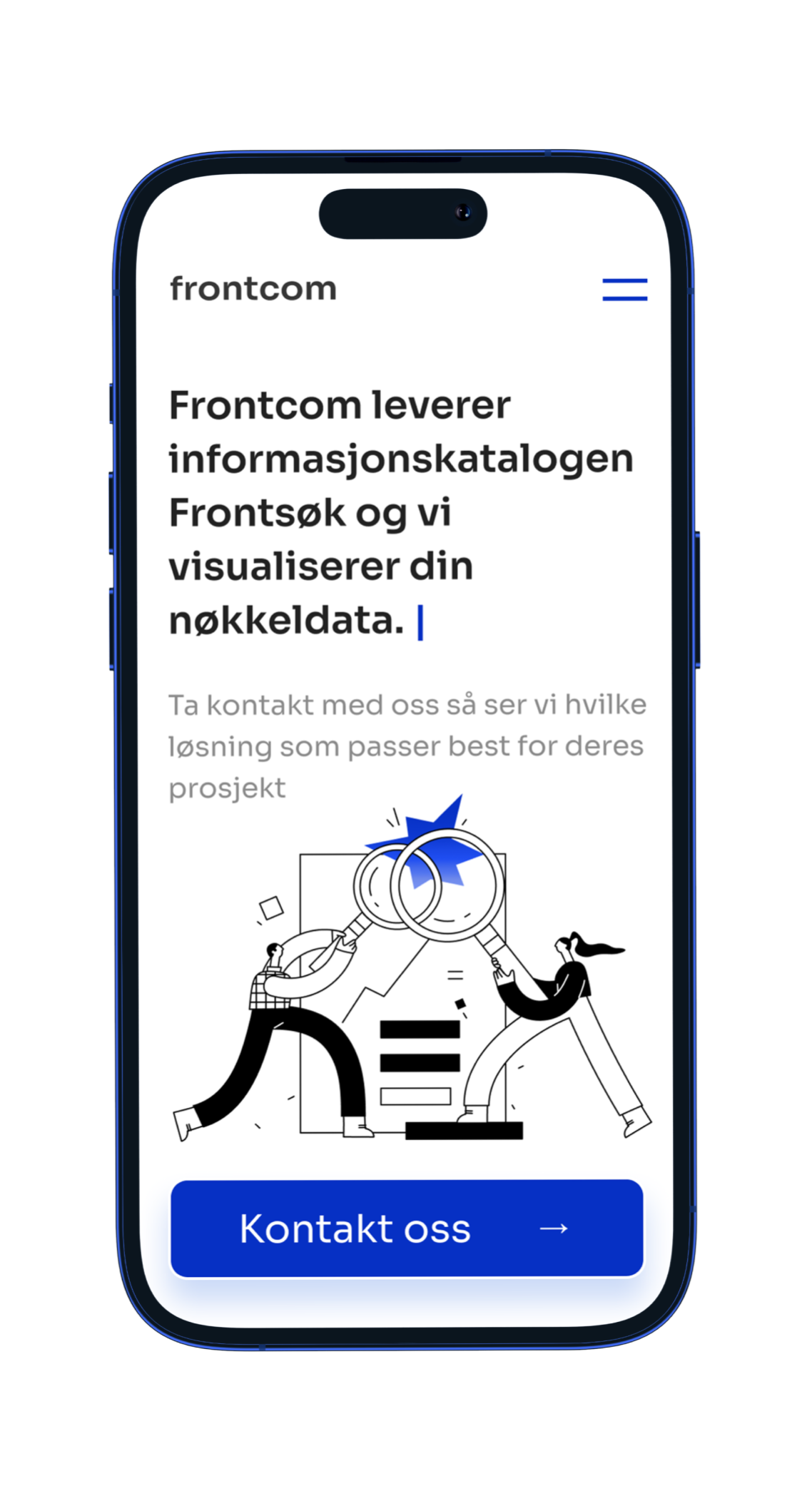
- Website Redesign
- Website Development
2019
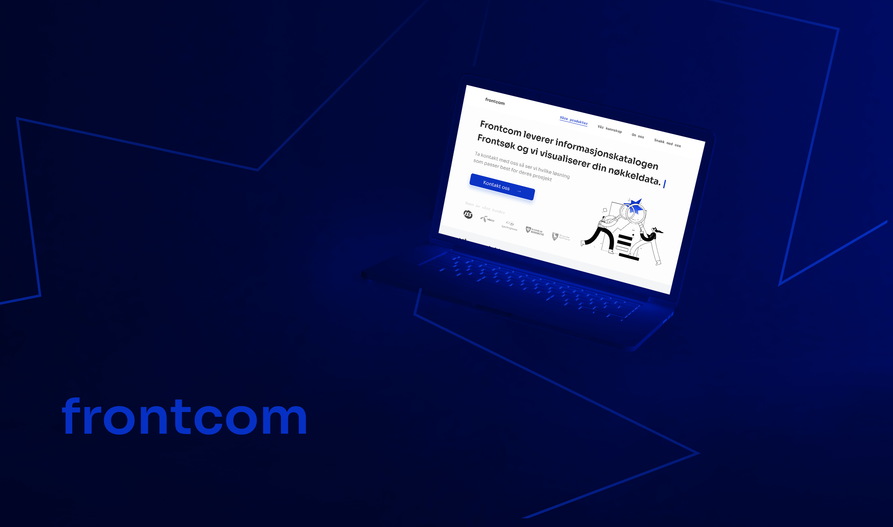
The goal of the redesign was to reflect Frontcom’s expertise in a simple, accessible, and modern way - focusing on clear communication and a visual system that would speak confidently to technical and non-technical stakeholders alike.
reductionIn bounce rate within first month
LongerAverage Session
SecondLoad time on all devices
CompliantWith an accessibility standarts
KAN’s existing digital presence didn’t reflect its scale or legacy. With dozens of real estate developments, awards, and decades of architectural leadership, the brand needed a website that could act as both a comprehensive platform and a digital brand ambassador.
The goal was to create a multi-page experience that captured KAN’s identity, displayed real estate content in flexible ways, and could evolve with the company’s future growth.
We developed illustration system of gradient figurines and abstract personas, adding character and clarity without overloading the page with visuals.
Redesign delivers a simple, trustworthy, and professional digital presence — tailored for the complexity of government and enterprise software, but approachable for any decision-maker.
Minimal. Structured. Human.
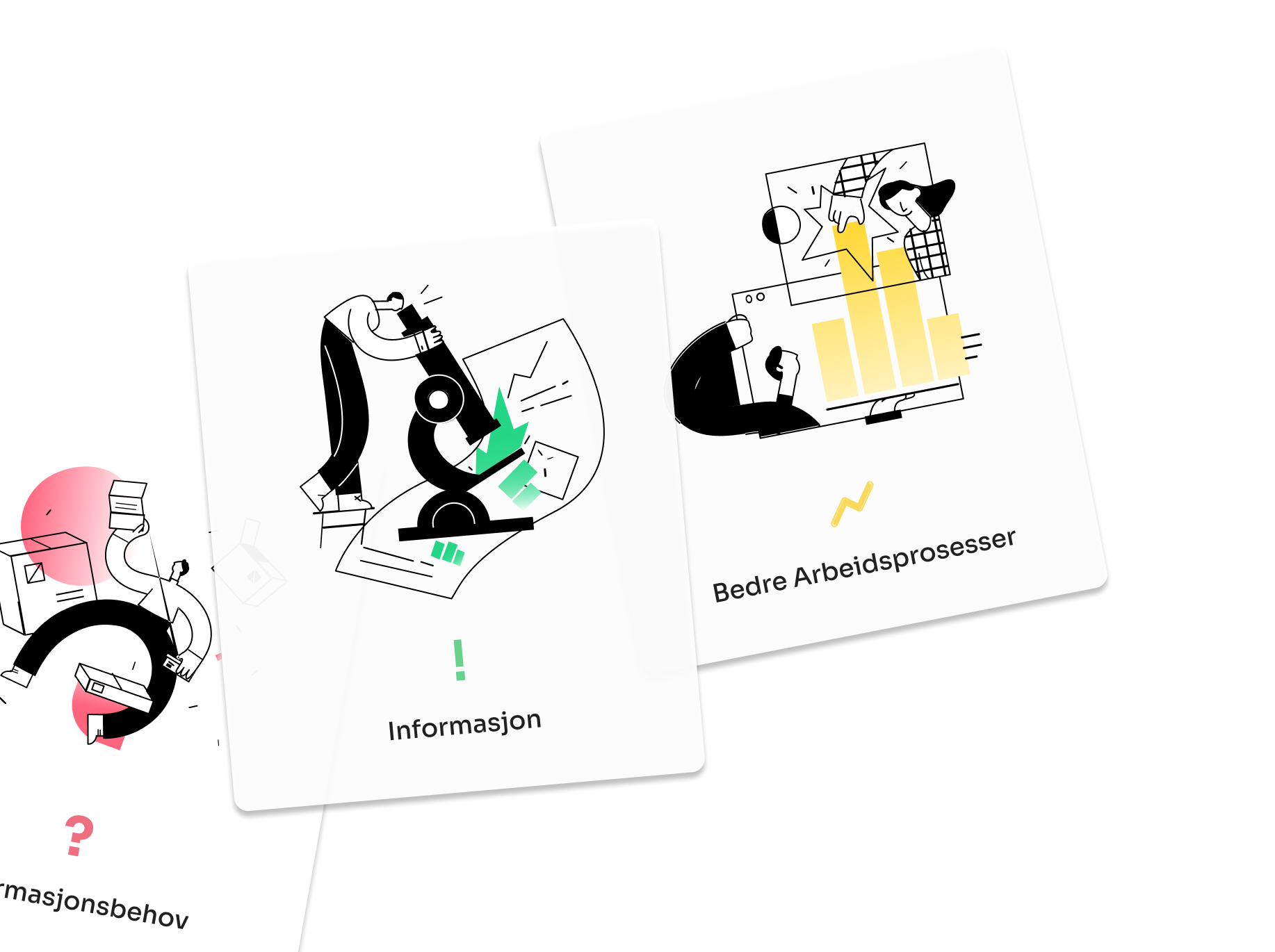
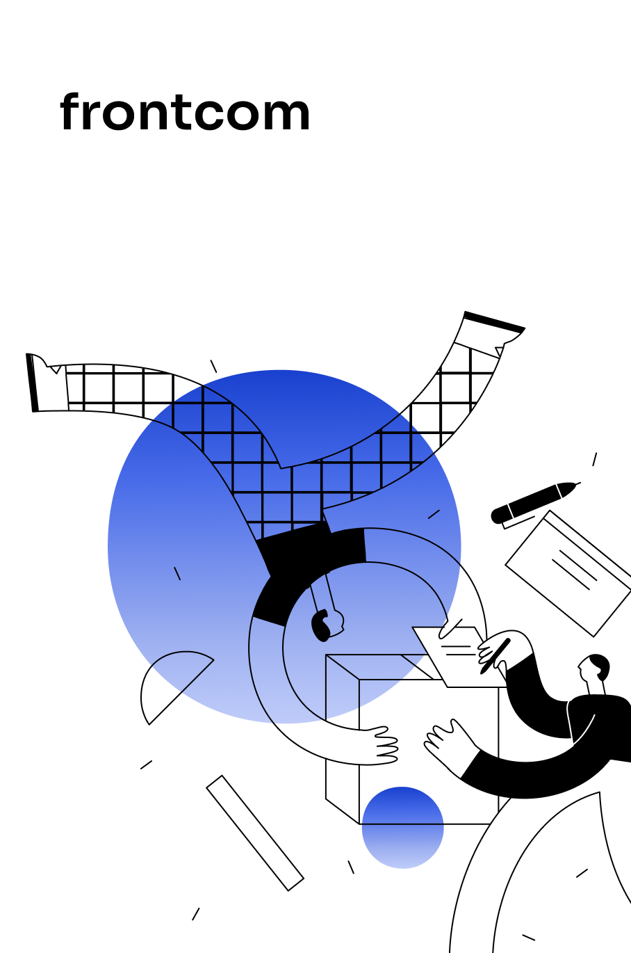
Frontcom’s new visual identity emphasizes restraint and clarity. The interface is based on strict grid systems, generous white space, and a neutral palette, allowing text and illustrations to lead. The custom figurine illustrations introduce just enough personality to keep things memorable, while never distracting from the core message.
Used for headlines works best with big titles

Used for Web app works best with regular text buttons

Built for Scale and Longevity
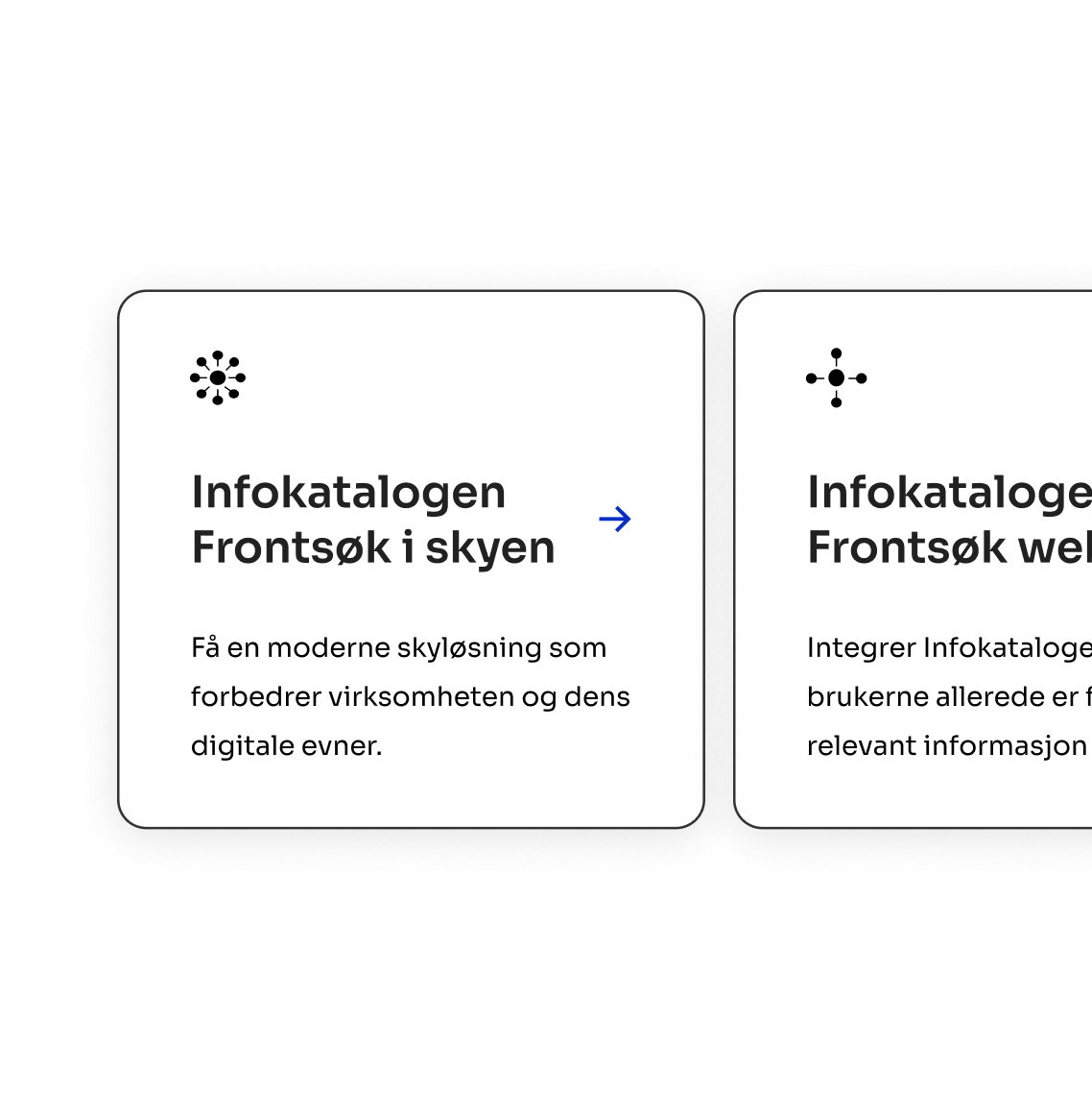
The website was built with performance and clarity at its core- fully static, responsive, and SEO-optimized, with zero external libraries beyond what was necessary for illustration rendering and form handling.
All animations and illustrations are lightweight, ensuring full functionality even under low bandwidth conditions — a must for compliance in government use cases.
react
node js
aws
- Wellness
- HomeGoods
- B2C
- Graphic Design
- Basic Identity
2019
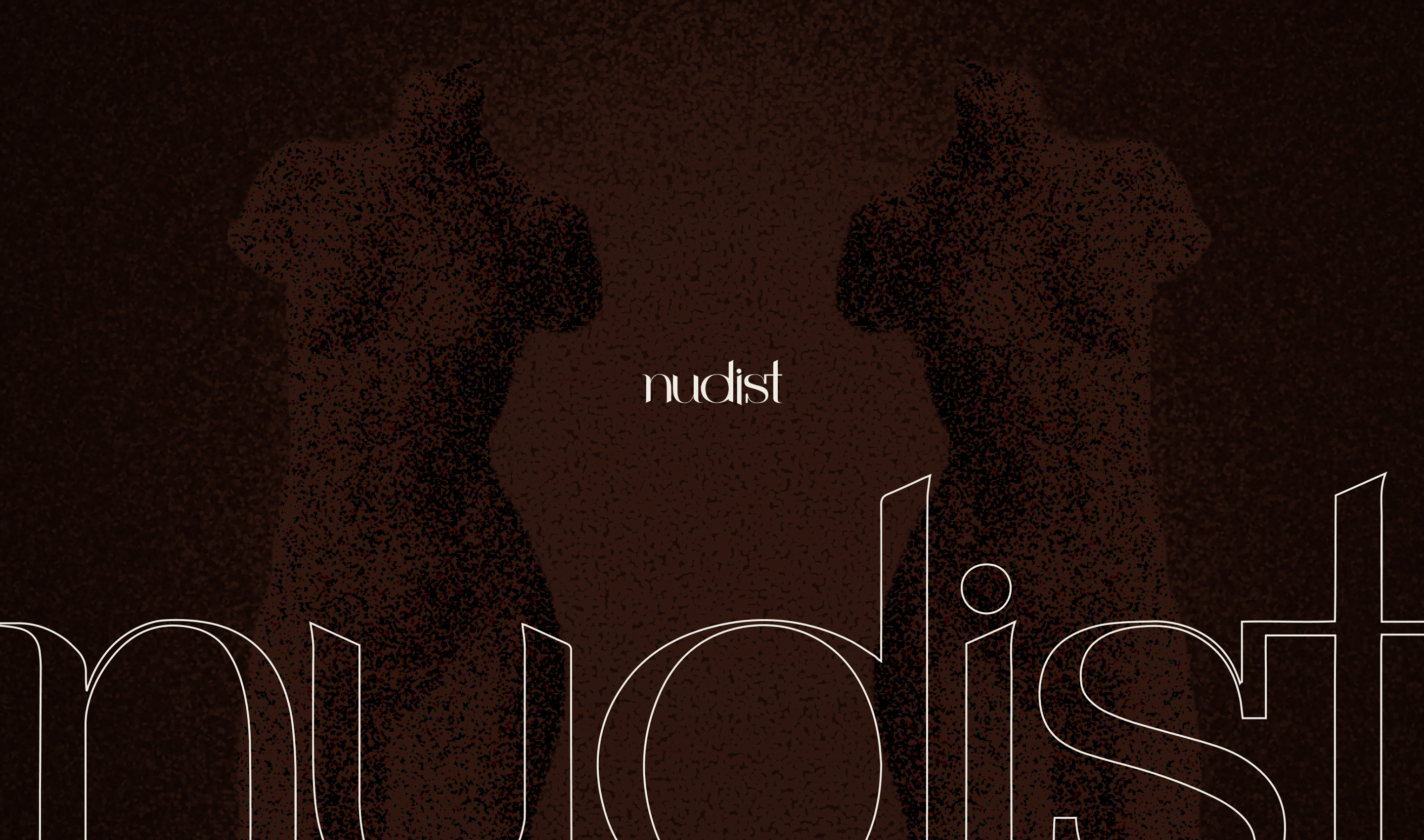
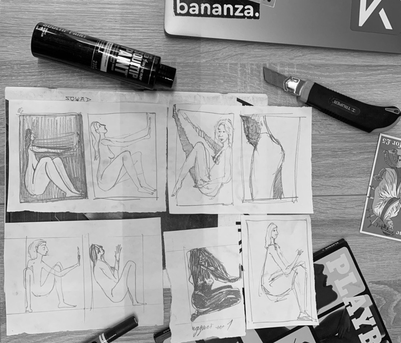
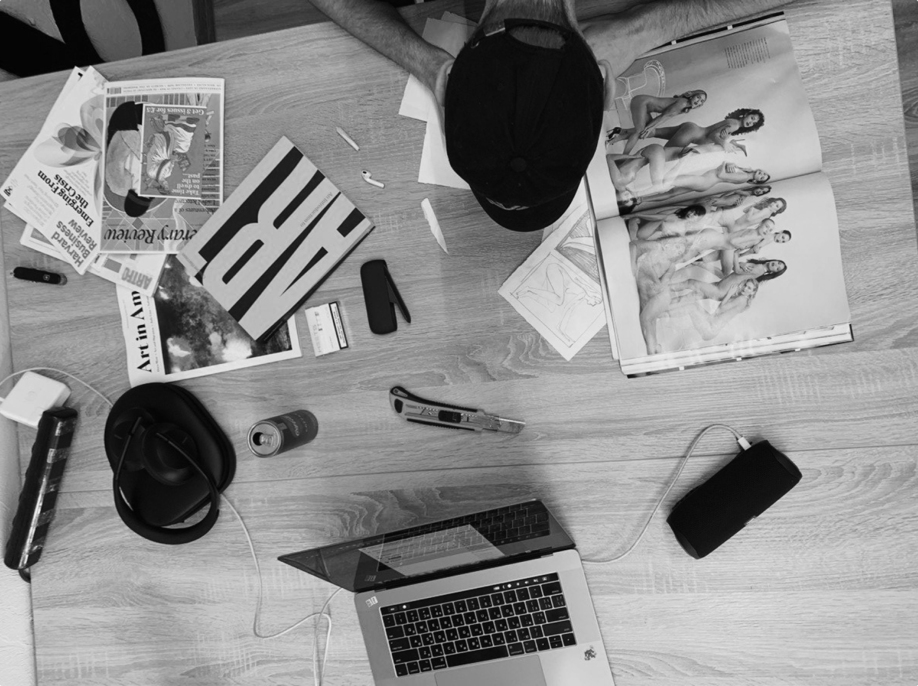
Nudist is a candle brand celebrating the human form through hand-poured sculptural candles shaped like male and female bodies. The brand needed an identity that felt both editorial and intimate - a visual world that could live comfortably between high fashion and personal ritual.
While the product itself was striking and memorable, the brand lacked a cohesive visual system. There was no logo, no structure to packaging, and no clarity in tone.
Nudist needed a refined visual world - something that embraced the body without feeling provocative, and felt luxurious without trying too hard.
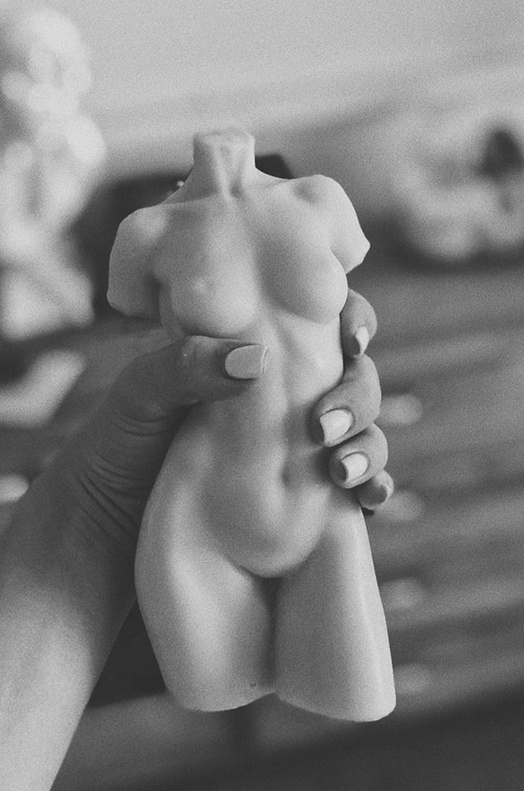
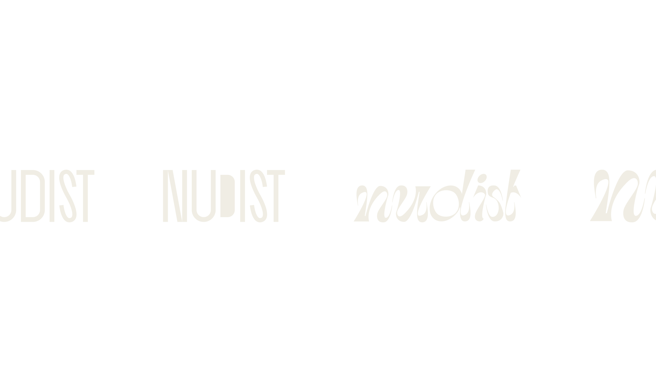
Sculptural. Sensual. Editorial.
Nudist’s visual identity is designed to celebrate the human form while remaining subtle and elevated. The logo is confident and minimal, designed to sit comfortably on packaging, print, and press.
The graphic system is intentionally spare, leaving room for texture and photography to take over. Everything - from the embossed box to the spacing in the wordmark - is built around the idea of form and presence.